Figure Inspectors
To view the inspector panel for the selected figure then either:
- Click an appropriate icon in the inspector bar, or
- Click the Inspector toolbar button to open the inspector shelf.
Style
The style information for a figure includes coloring, borders, fill, font, and much more. With just a click the look of your figure can change completely. You can even save these looks as personal styles to use them again and again.
Inspector Bar
At the far left of inspector bar you’ll find a Style button which displays a quick, popup gallery for the currently selected figure. Simply click on a style to update its look.
Inspector Shelf
You can also use the mini style gallery at the top of the Shape inspector shelf to do the same thing.
And, lastly, you can right-click on a figure and choose Apply Style to choose a style from the gallery that appears.
All of these interfaces give you an opportunity to choose either a bundled or personal style that you have created. Curio Professional users can also select a master style.
Text
Curio has loads of text options for you to tweak!
Inspector Bar
If the figure contains text then you’ll find several controls on the inspector bar itself for fast access to popular attributes.
Font and Font Size
Select a font for the selected figure.
Select or directly enter a font size. Tip: you can also use the standard Command+ and ⌘ keys to increase or decrease the font size.
Text Color
Specify a text color. Clicking will show a quick color chooser while ⌥Clicking will display the standard Apple Color picker.
Highlight/Background Color
Specify a text highlight/background color. This color control remembers the last used color even between launches.
Clicking will show a quick color chooser while ⌥Clicking will display the standard Apple Color picker. Hold the Shift key and the color well will show that previously-used color, the default is a nice light-yellow color, and then click the color well to apply that color to the selected text for instant highlighting.
Character Attributes
Specify attributes such as bold, italic, underline, strikethrough, superscript, and subscript.
Markdown
Enable markdown syntax parsing and rendering. Click here for more markdown details.
Shadow
Click the shadow button to display a popover allowing you to customize the shadow applied to the figure’s text. Note this is different that the shadow which can be applied to the overall figure itself as specified in the Shape inspector.
Paragraph Attributes
Click the paragraph button to display a popover for setting several paragraph properties. You can also set many of these options by right-clicking on the text figure and using the context menu that appears.
Minimum Height
A text figure can have a minimum height which is used when empty or when it contains very little text. As more text is added, it will automatically grow in height as necessary to fit the new text. As text is removed, it will shrink down to that minimum height. This feature is very useful if creating forms or templates and would like to use text blocks for certain areas. After enabling this feature, just resize the figure using the selection handles to set the minimum height. This feature is also useful in combination with the maintain spacing feature in the Geometry inspector so that neighboring figures will push away or pull back as content is changed.
Freeform
If a text figure is freeform then that means you are in complete control of its width and height, clipping any text vertically if necessary. If not freeform then Curio will automatically grow a text figure’s height as necessary to hold its contents.
Line Height
If you have an idea space with only a horizontal grid, like a notebook paper grid, then the line height can be set to match the grid’s spacing. Or the line height can be determine automatically based on font size.
Inspector Shelf
The inspector shelf includes the same controls described above for the inspector bar, plus more since there’s more room available in the shelf:
Typeface
Select a specific font typeface, such as “Light” or “Medium Oblique”.
Automatic Capitalization
If a figure is selected, not just selected text within a figure, then you can select an automatic capitalization such as lowercase, uppercase, sentence, capitalize, and titlecase. Your text is stored as you entered it but will be transformed right before display with the specified capitalization.
- None - Leave as-is.
Ex: “the new macos sierra for iMAC and MACBOOK Pro integrates with IOS devices.” - Uppercase - Uppercase all letters.
Ex: “THE NEW MACOS SIERRA FOR IMAC AND MACBOOK PRO INTEGRATES WITH IOS DEVICES.” - Lowercase - Lowercase all letters.
Ex: “the new macos sierra for imac and macbook pro integrates with ios devices.” - Sentence - Lowercase all except first word and products.
Ex: “The new macOS Sierra for iMac and MacBook Pro integrates with iOS devices.” - Capitalize - Capitalize each word except products.
Ex: “The New macOS Sierra For iMac And MacBook Pro Integrates With iOS Devices.” - Titlecase - Capitalize in general but lowercase certain words like ‘for’ and ‘and’, etc.
Ex: “The New macOS Sierra for iMac and MacBook Pro Integrates with iOS Devices.”
Shape
To change your figure’s shape properties either click the Shape button on the inspector bar, or see the Shape tab in the inspector shelf.
Inspector Bar
The Shape button on the inspector bar brings up the Shape inspector popover, which contains the same inspector panels as those found in the inspector shelf described below.
Inspector Shelf
Shape
The figure shape inspector allows you to change visual properties such as coloring and border style.
Color
Set the color of the figure stroke. In the case of a geometric figure this is the color of the border; in the case of a line this is the line color. Simply click on the color well to see a quick color matrix, or ⌥Click on the color well to see the standard Mac OS Color Picker.
Geometric Shape
Set the geometric shape of the figure such as Rectangle, Triangle, Hexagon, or Cloud.
Dash Pattern
Set the stroke dash pattern.
Width
Set the stroke width. Tip: press the [ or ] keys on your keyboard to decrease or increase the current thickness of the selected shape figure or line figure.
Corner
Set the corner value which determines the radius of certain shapes, like rounded rectangles, or the complexity of other shape, like clouds. In particular, the Left and Right Signpost shapes and the Underline shape will change their look substantially as you change the corners value.
Tip: press the { or } keys on your keyboard to decrease or increase the current corner value of the selected figure.
Margin
Set the margin which determines the distance between a shape’s edge and its contents.
Tip: press the ⌥{ or ⌥} keys on your keyboard to decrease or increase the current margin value of the selected figure.
Smart Coloring
Several smart options can be specified.
The fill color can be determined automatically by Curio so that it matches your selected stroke color. Likewise, the figure’s text color can be determined automatically as appropriate based on the fill color. Curio will automatically choose a white text color when the fill is dark, else a black text color for lighter fill colorings.
Fill
You can fill the interior of the figure shape with a color or gradient.
None
None will allow the figure to be transparent.
Solid
For solid fills, click on the color well to choose a color from the matrix that appears. Or, ⌥Click on the color well to go directly to the standard color chooser.
Simple Gradient
For simple gradient fills, click on the color well to choose a color from the matrix that appears. Or, ⌥Click on the color well to go directly to the standard color chooser. Curio will then make a smooth gradient using that color.
Bowed Gradient
For bowed gradient fills, click on the color well to choose a color from the matrix that appears. Or, ⌥Click on the color well to go directly to the standard color chooser. Curio will then make a smooth bowed gradient using that color.
Linear Gradient
For linear gradient fills, drag the color stops to adjust the gradient ramping. Double-click on a color stop to edit its color. Double-click on the gradient to insert a new color stop.
Drag a color stop down and off the gradient control to remove the stop from the gradient.
The resulting gradient will be rendered along the angle specified by the angle slider.
Radial Gradient
For radial gradient fills, drag the color stops to adjust the gradient ramping. Double-click on a color stop to edit its color. Double-click on the gradient to insert a new color stop.
Drag a color stop down and off the gradient control to remove the stop from the gradient.
The resulting gradient will be rendered with a center point located as specified in the point locator control.
Glossy Fill
For glossy fills, you choose just a single color and Curio will automatically construct the appropriate gradient styling to render a glossy shape.
Effects
Shadow
Enable a shadow for the figure. The shadow can be customized by specifying the color, blur, and x/y offsets. By default, if the figure is filled, then the shape’s shadow attributes are applied to the shape itself, otherwise if the figure is unfilled, then those shadow attributes are applied to its text.
You can control whether the shape shadow is automatically used as a text shadow. By controlling this feature you can specify a shadow for the shape and a different shadow style for the text itself, using the text inspector.
Shadow Effects
Enable a shadow special effect:
- A pinched shadow looks like the figure has been placed on a tabletop where only the bottom corners of the figure are slightly raised from the surface, like you’re pinching the edges and lifting them up.
- A bulged shadow is the opposite of a pinch: here the bottom center of the figure is slightly raised from the surface, like you’re creating a bulge in the center of the photo.
These effects are only available for filled, rectangular shapes with no curved corners.
Opacity
Set the shape opacity making the entire shape more or less transparent. Note that this effects the entire figure uniformly.
For more advanced transparency effects, in lieu of setting the overall opacity, you can specify a specific opacity for the shape’s fill, gradient, and stroke colors within the standard Mac Color Picker.
Auto Inflate
Normally certain shapes are set to auto inflate automatically to minimize the amount of clipping that would occur to its content whether that be text or an image.
For example, the Cloud shape automatically inflates itself a few pixels so the bumps of the cloud don’t crowd or clip the content. The result is a nicer looking resulting shape without you having to fidget with margins. You can turn this off if you wish to have more direct control over your shape.
Preview vs Icon
For figures representing files, you can set whether the figure is displayed with the file’s icon & title, like the Finder, or if the figure simply exists as an image preview.
As a tip, you can also right-click on a figure to change its display mode between icon and preview and, when in preview mode, you can toggle the display of the preview caption.
If displayed as an icon then:
- An icon size slider will appear so you can specify its size. Up through a size of 128x128 the default icon for that document type is used, continuing up to 256x256 a Quick Look thumbnail of the file is used for the icon instead. Note that this icon size slider is also used for text figure attachments if one has been attached to a given figure.
- You can change the icon’s title but note that Curio will also rename the underlying asset file’s name as well, to keep them in sync. When setting the file name Curio will automatically strip any invalid characters from the title text so macOS doesn’t complain.
Else, if displayed as a preview then:
- If an image file, Curio will simply display that image, else Quick Look is used to grab a preview of the file. Previews can be displayed with an optional caption which is displayed under the preview image.
- Your previews can have captions if you wish. By default, these captions are placed inside the overall shape border, or you can specify that captions should be displayed outside the border. Captions can also be enabled via right-clicking on the figure. Initially the caption will be the same as the underlying asset file’s name. However, you can change this to anything you wish and the asset file’s name will not be changed, thereby allowing long, detailed captions if you’d like.
- Alternatively you can tell Curio to clip the preview image to a specified mask. This is useful when you want your overall figure to have one shape — and perhaps it contains other contents such as text, fill color, and adornments — but you still want your image preview to be clipped to a specific shaped mask, such as a circle.
Geometry
Bounds
The bounds defines the figure’s size and position in the idea space.
X, Y, Width, Height
Set the figure’s x, y location and the width and height.
Natural Size
When the Natural Size button is clicked or the N shortcut is pressed, then a text figure or image figure will grow to its natural size, but remain constrained by the current width of the idea space. If the Shift key is held when clicking Natural Size or pressing N then it will grow to its unconstrained natural size, and the idea space will expand if necessary.
Constrain Proportions
Set whether the figure is resized proportionally which is enabled by default for images and asset figures displayed as previews. For non-image figures you can resize proportionally on-the-fly by holding Shift and resizing with the figure’s selection handles.
Rotation
Specify the rotation of the figure, or zero the rotation. Tip: use the R and ⇧R keys to rotate a figure in increments either clockwise or counterclockwise. The Z key can be used to zero the rotation.
Auto Layout
The layout control is a method for defining how a figure should automatically position and size itself if the idea space changes size.
Springs and Struts
Curio uses the “springs and struts” method for laying out items. The smaller, inner box represents a figure, which is contained in a larger box which represents the idea space itself. The red and green lines determine whether its position or size is fixed (a strut, represented by a red line) or flexible (a spring, represented by a green arrow).
Examples
For example, give a figure a flexible width and a flexible top margin and you’ve created a footer figure. Place it down at the bottom of your idea space and as the idea space changes size the figure will remain stuck and centered at the bottom of the idea space.
At the top of this page, click on the subheading (“Set the figure’s geometry..”) and look at its layout. It’s set to remain stuck to the right side of the idea space while its width is allowed to change.
Automatic Layout via Idea Space Guidelines
Idea space guidelines provide a helpful margin around an idea space you you can drag and resize items so they snap against the margin or even against the edge of the idea space itself. You can toggle them via the Arrange > Idea Space Guidelines menu.
Start moving or resizing a single figure then hold down the Control key. You’ll notice, as you bump against a guideline, the guideline is drawn with red! This indicates that you have set a new strut as a layout constraint and, indeed, if you watch the Geometry inspector as you do this you’ll notice springs and struts appearing automatically.
Thanks to this feature you can quickly position and size a figure along with setting appropriate auto layout rules, all without touching the layout control.
Maintain Spacing
You can tell Curio to maintain the spacing of figures closely underneath the selected figure. This means that this figure is resized, either manually or by changing styles or content, then the figures closely underneath (within 50 pixels) will automatically scoot down or back up as the figure’s size changes. By setting this attribute, which can be saved with custom figure styles, you can have figures shift themselves down and up as figure contents change!
- The figure being resized must have the auto spacing property enabled.
- Only resizing an auto space figure impacts lower figures, not moves.
- Only those figures within the 50 pixel boundary will be moved up or down. If those figures also have auto spacing enabled, then Curio looks below those figures as well, and below those, etc…
- Moving a figure completely away doesn’t collapse the figures. It’s simply no longer impacting those figures previously underneath it. It still has the auto space property, of course, so now it will impact figures in its new location when it resizes.
- Moving a figure from elsewhere into an area close to another figure doesn’t automatically scoot everything down. Curio allows you to place things where you want it to go.
- Again, resizing is what triggers the auto spacing. This means you can still manually move and position figures anywhere you wish, maintaining the unrestricted, freeform nature of the idea space environment.
Arrange
Drag the slider to bring the selected figures as a group either closer to the top of the figure stack or further back.
If multiple figures are selected then those items are moved independently up and down the figure stack, keeping their same relative stacked distance away from each other. In other words, bringing forward figures placed at 5 and 10 in the figure stack will move them to place 4 and 9, where 0 is at the top of the figure stack.
You can also click on the icons on the far left and right sides of the slider to move the items back or forward in steps. If the Option key is held down while clicking those back/front icons the selected figures are moved together in figure stack as a group. That means they are grouped together into the same stack placement then moved up and down en masse.
Flip
Click the flip buttons to flip an image figure vertically or horizontally.
Align & Distribute
Use the align and distribute buttons to quickly arrange multiple selected figures.
Meta
Inspector Bar
The Meta button on the inspector bar brings up the Meta inspector popover, which contains the same inspector panels as those found in the inspector shelf described below.
Inspector Shelf
Adornments
An adornment is a little image that appears next to your figure. It may represent a tag, or a due date, or a checkbox.
Size and Position
Set the size of the adornment images. Tip: press the ⌥[ or ⌥] keys on your keyboard to decrease or increase the current adornment flag size for the selected figure. Use the radial spinner to position the adornments all around the selected figures. You can also indicate that the adornments should be displayed inside or outside the figure’s border. Note that some collection figures may force the position of adornments.
Clicking on the Adornments
Many of the adornments displayed next to figures can be clicked-on and changed:
- Checkmark Adornment
Click to check/uncheck. ⌥Click to display the percent complete mini popover. ⌘Click an unchecked item with a due date to check it and change its due date to today. - Tag Image Adornment
⌥Click to display the tags mini popover. If the tag set is “only one tag in set can be active” then if the tag is in a set with 3 or fewer tags within then clicking the tag adornment will cycle through the tags. If more than 3 then a handy popup will appear so you can choose one of the other tags. - Start/Due Date Adornment
⌥Click to display the start/due date mini popover. - Rating Stars Adornment
Click to display the ratings popover. ⌥Click to cycle through the ratings. ⇧Click to cycle in reverse order. - Priority Adornment
Click to display the priorities popover. ⌥Click to cycle through the priorities. ⇧Click to cycle in reverse order. - Bookmark Adornment
Click to display the bookmark colors popover. ⌥Click to cycle through the boomark colors. ⇧Click to cycle in reverse order. - Jump Action Adornment
Click to perform the jump action. - Note Adornment
Click to display the Notes window.
Checkmarks
Toggle the display of checkboxes using the on/off switch. Click the adornment itself to check or uncheck the figure.
Percent Complete
You can set a percent complete value from 0% to 100%. Use the stepper arrows to increment/decrement by 1, or hold Shift and click to change by 5.
Checking is a shortcut to setting a percent complete of 100%. Likewise, unchecking is the same as a 0% completion.
Child Figures
By default if the figure has children under it, like in a list or mind map, then its percent complete value is automatically computed using the percent complete values of its children.
Resources
If the figure has assigned resources then you can specify that the percent complete value is computed using the percent complete value assigned to each individual resource in the Resources tab.
Tip
Press ⇧X to toggle the visibility of a checkmark for the selected figure. Press X to check or uncheck it.
Mini Popover
Curio has a handy mini popover for setting percent complete which can be handy when you don’t want to bring up the inspector.
- To show the percent complete mini popover: ⌥Click an existing checkmark adornment, or press the Period key. As a hint to remember this keyboard shortcut, think of a long line of dots indicating progress being made. Use the stepper arrows to increment/decrement by 1, or hold Shift and click to change by 5.
- To hide the percent complete mini popover: Press the Escape key, or click its little close button.
Tags
To view the tags associated with the selected item either click the Meta button in the inspector bar, or see the Meta tab in the inspector shelf.
Tags are words or phrases that you can define and associate with your items as searchable meta information. A tag can be local to a particular project, and used perhaps like a handy keyword, or it can be a global tag set available for use within all of your projects.
For instance, if you have a project for a research paper, then you may use local project tags to quickly tag and find documents, notes, and images you bring into your Curio project.
On the other hand, you may create a tag set titled “Tasks” containing tags such as “Possible”, “On Hold”, “Started”, “Working On”, and “Completed”, that you use to tag items in all of your projects. Then you can use the Status shelf to quickly search across all of your projects to see what figures are “On Hold”, for example.
Sharing Global Tags with Others via Extracted Tags
On a related note, if you share a project you created with others then obviously those users would have access to the local tags, but what about your global tags?
Fortunately, Curio will embed an “extract” of any global tag sets you have referenced in the project so your colleagues will see those same tag associations. When they view the Meta inspector on their Macs those extracted tag sets will be available but grayed out to indicate they cannot delete or otherwise modify those tag sets. However, they can change tag associations from that set — for example, they can change a figure from “On Hold” to “Working On”.
Assign Tags via Typing with Tag Name Completion
You can associate tags with the selected items simply by typing the tag name. A completion list will appear as you type so you can choose an existing tag, or you can continue typing and press the Return key to create an on-the-fly local project tag.
Assign Tags via Hierarchical List or Image
You can also associate tags using the tags hierarchical list or click the button to turn it into a handy matrix showing only those tags with images.
Working with Tag Sets and Tags
Use the action button and tag properties at the bottom of the inspector to modify or create new tag sets and tags. These tags can either be local to your project or global and available across projects and for grouping purposes in the Status shelf.
- Create a new tag set or tag in the current tag set using the action button.
- Tag sets and tags within a tag set can be arranged in a specific ordering, or you can use action button to sort them.
- Change a tag name by double-clicking it.
- To delete a tag, select it and press the Delete key.
- Use the action button to sort the tag sets and tags within the current set. You can also import an extracted tag set from a foreign project into your own shareable global tag sets. For instance, from the example above, if you’re viewing a colleague’s project with that “Tasks” extracted tag set then you can select it and use the action button to import it into your own global tag sets. All internal identifiers are kept the same so you can continue to share projects with your colleagues that use that same tag set.
- Click the ‘Click to Record’ field to record a keyboard shortcut to quickly apply certain tags to figures. All shortcuts must include Control-Shift to avoid conflicts with existing Curio shortcuts.
- Assign an emoji or character symbol to a tag by clicking in the emoji field and pressing Control-Command-Space to bring up the standard macOS Character Viewer. Double-click on an emoji or text symbol and instantly it will be entered as the “image” for the tag. Emoji are great because they’re perfectly scalable and consume very little disk space for the project. If you choose a text symbol then use the little color well next to the emoji field to specify a tinting color for the symbol. This way you can turn a boring black down arrow symbol into a noticeable red down arrow.
- Alternatively you can drag in or paste an actual image into the tag’s image well. As a note, you can drag multiple images (icns, png, or jpg) from the Finder into the tags panel to add lots of image tags to an existing tag set, where their tag names are derived from their file names. Download perfect tag images from sites like IconFinder or search SmashingBuzz or Google for icon sets for more recommendations.
- When a tag has an image (emoji or actual) then it is displayed as an adornment next to the figure’s other adornments. Use the adornment size slider to change its size.
One Tag Active
When a tag set is selected, note the ‘only one tag in the tag set can be active’ checkbox. Checking this option is perfect for those tag sets which represent a specific state or status. Choosing a tag in this set will automatically turn off the previously associated tag from this set.
For example, with the Detailed Tasks tag set you are specifying a GTD-style state for that task like pending, active, or done. If the current state of a figure is active then setting a tag of done will automatically turn off active.
These types of tag sets have a couple of extra ways to assign tags to a figure:
- If your tag set has 3 or fewer tags with images then clicking the tag’s image adornment will cycle through the tags in the set.
- If your tag set has more than 3 tags, then clicking the tag’s image adornment reveals a popup so you can quickly choose the new tag.
Assign Figure Tags via Context Menu
Right-click on a figure and choose a tag from the context menu that appears to toggle the tag association.
Assign Figure Tags via Mini Popover
Curio has a handy mini popover for setting tags which can be handy when you don’t want to bring up the inspector.
- To show the tags mini popover: Option-click an existing tag adornment, or press the Comma key when a figure is selected. As a hint to remember this keyboard shortcut, think of a comma-separated list of tags. When the mini popover appears type in a tag name. A completion list will appear as you type to help you choose an existing tag if you wish.
- To hide the tags mini popover: Press the Escape key, or click its little close button.
Dates
Your figures can have assigned dates for easy task planning. Curio even supports automatic date calculations in collections such as lists and mind maps so that tasks can have precedence ordering.
Start Date
Enable start dates with the on/off checkbox. Then you can set a start date. The date can be entered directly or you can click the little calendar button to pick a date.
Optionally Curio can automatically calculate the start date if you wish. Curio’s pretty smart about this and will check to see if it should be determined by you manually entering a date, or based on when a previous sibling (in a list or mind map) ends, or based on when a previous sibling starts, or when a parent starts. Or you can directly choose one of those options if you wish. For example, if an item is the first child in a list then Curio would automatically choose ‘based on when parent starts’. If the item is a middle child then Curio’s chooses ‘based on when previous sibling ends’.
Due Date
Enable due dates with the on/off checkbox. Then you can set a due date. The date can be entered directly or you can click the little calendar button to pick a date.
As with start date, Curio can automatically calculate the due date if you wish. In this case, the due date can be determined by you manually entering a date, or automatically determined when this figure’s children have all ended, or based on the start date plus an entered duration. If the due date is at midnight then the due date adornment next to the figure reports the day before. For example, say in the date inspector for a figure you set the start date to June 6th at midnight and the due date to June 8th at midnight, thus it a 2-day duration. The resulting adornment will show “6/6 - 6/7” since that looks more appropriate (i.e. you have to work on the 2-day task on 6/6 and 6/7). This change was made so it matches what is displayed in applications such as Calendars where the task would be displayed from 6/6 to 6/7.
Start/Due Date Action Button Menus
Note both the start and due date areas have action button menus which allow you to specify if ‘manually’ should always be used as the default.
Via the action button you can also specify your project work schedule including work days and work hours. Curio will use this work schedule to automatically determine task end dates based on start dates and durations within the current project. For instance, click to turn off Saturdays and Sundays if you want Curio to ignore weekends when calculating due dates and durations. This same work schedule is taken under consideration when using the +1 Day, +1 Week, and +1 Month buttons.
The start date action button also allows you to specify what time should be used: either midnight, the current time, or the workday start.
Duration
Specify a duration for the figure in minutes, hours, days, weeks, months, or years.
Curio can use these durations when computing start and due times for siblings and parents figures in a hierarchical collection such as a list or mind map.
Note that if the due date is determined by some means other than Start Date + Duration then the duration and most appropriate duration units will automatically be determined and displayed.
Done Date
The done date is completely independent of a figure’s specified end date. You can think of the former as when the task was actually done, while the latter is when the task needs to be done.
By default the done date is automatically set when a figure is checked or marked as 100% completed. The reverse is also true, if you set a done date Curio will make sure the figure is marked as 100% completed and checked if the figure checkmark is visible.
The done date also has an action button menu where you can fine-tune the done date’s automatic setting, and also specify how the done date time should be reported: start of the day, the end-of-work day as specified by the Workday Schedule (set via the dates meta actions menu), or the end of day.
Added Date
The added date is set by Curio automatically when you add a figure to an idea space. However, we allow you to change the date if you’re trying to mark a specific date of entry for note-taking or research purposes.
Mini Popover
Curio has a handy mini popover for setting dates which can be handy when you don’t want to bring up the inspector.
- To show the date mini popover: ⌥Click an existing date adornment, or press the Slash (“/”) key. As a hint to remember this keyboard shortcut, think of a slash used in a date such as 12/25/2013.
- To hide the date mini popover: Press the Escape key, or click its little close button.
Resources
Assign resources to your figures and Curio can perform more advanced task tracking.
Adding Resources to the Project
You can specify a name, email address, and image for each resource either manually or by drag-and-dropping contacts from the macOS Contacts app directly to the Resources inspector panel.
Deleting Resources
Select one or more resource items then click the Remove button to remove them.
Assigning Resources
Click the resource’s checkbox to actually assign a resource to a figure.
Here you can also double-click the ‘% Complete’ field to enter that person’s percentage complete value for this task. Curio can use all of these assigned completion values to determine the figure’s overall completion value as noted above in the Meta tab discussion above.
The resource’s image will be displayed next to figures as an adornment. In a hierarchical collection, such as a mind map or list, you assign resources to child nodes and the parent nodes automatically inherit them. You cannot assign resources to a parent node directly unless you uncheck the inherit from children checkbox in the resources inspector.
Actions
The figure actions inspector can be used to specify what happens when a figure is double-clicked within the idea space.
Setting an Action
Choose the desired action from the popup menu at the top of the inspector. The choices of action include:
- Default
Do the default double-click action for this figure. For example, for an image figure it would open the image, a URL would go to the web location in the browser, an asset figure would open the asset file. - Go to Idea Space
Choose an absolute item like first or last; a relative item like next or previous; or backward or forward in history. - Open URL
Enter a URL that should be opened. - Create Mail Message
Enter a default ‘to’ and ‘subject’ field. Note that the message will be created and displayed but not actually sent. - Open File
Choose a file that should be opened. - Go to Jump Target
Begin by copying a figure or idea space so its jump location will be on the clipboard. then click Retrieve from Clipboard here to retrieve it. - Run AppleScript
When you click the Edit button the script associated with the action is dumped to a temp file then Script Editor is launched to edit it and save to that location. When you click the Update with Edits button Curio retrieves the contents of that temp file and stores it back into the figure’s action data. - Do Nothing
Handy when you want to override the default so nothing happens when this figure is double-clicked.
Adornment
By default Curio will show a little adornment next to a figure that has an assigned action. You can specify whether that adornment is displayed or not.
Mac App Store Restriction
Curio from the App Store is unable to support AppleScript actions.
Custom Data
Curio Professional users can create their own per-project custom data keys, such as Cost and Effort, and then enter figure values for those keys.
Automatic formatting plus prefixes and suffixes are supported as well.
Custom Data vs Custom Variables
A related feature is custom variables. In short:
- Custom data allows you to create project-wide formatted keys, such as Price or Score, and then assign values to those keys for each figure, adding custom meta data to every figure for searching and export purposes.
- Custom variables are text replacements for variables you create and use throughout your project. For example, you can create a custom variable named Author and give it a value of George, then use the
{{Author}}variable markup syntax in your project’s text figures.
Creating Custom Data Keys
Select any figure then, using the Custom Data inspector panel in the Meta inspector, click the actions button menu (or right-click in the custom data list) and choose Add Key.
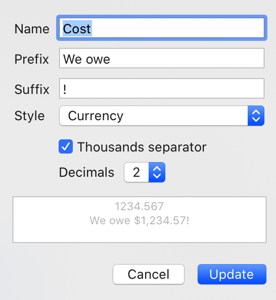
You can specify an optional prefix and/or suffix, which is prepended/appended to the formatted value, respectively.
In addition to simply treated entered values as text, Curio can perform automatic localized formatting with the following formats:
- Number: 1,234.567
- Percentage: 50%
- Scientific: 1.23E3
- Currency: $1,234.57
- Currency (Plural): 1,234.57 US dollars
- Currency (ISO Code): USD 1,234.57
- Currency (Accounting): ($1,234.57)
- Spell Out: one thousand two hundred thirty-four
- Ordinal: second
Localization of the thousands separator symbol, currency symbol, decimal separator, etc, are all automatically handled by the macOS locale specified via System Preferences > Language & Region settings.
Modifying Custom Data Keys
Select any figure then, using the Custom Data inspector panel in the Meta inspector, select an existing key then click the actions button menu (or right-click in the custom data list) and choose Modify Key.
Deleting Custom Data Keys
Select any figure then, using the Custom Data inspector panel in the Meta inspector, select an existing key then click the actions button menu (or right-click in the custom data list) and choose Delete Key.
Warning
If you confirm the deletion of a custom data key, any key values associated with figures in the project will be removed as well. This cannot be undone!
Editing a Figure’s Custom Data Value
Select the figure then, using the Custom Data inspector panel in the Meta inspector, right-click on the item and choose Edit Value, or double-click on the value for that key.
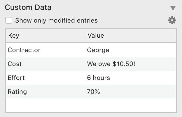
Note you’re editing the “raw” value for that key; don’t type commas or dollar signs or prefixes/suffixes. Once you finish editing Curio will show the formatted value using the key’s specified formatter settings.
So if editing a percentage value enter the raw number, like “.8”, and the formatter will turn that into “80%” when you finish editing. Similarly, entering a price as “2.5” will turn into “$2.50” when you finish editing.
Custom Data Adornment
When a figure has a custom data value it will display a special adornment alongside the figure. Hovering over the adornment will display a tooltip with all the custom data keys and values.
Clear a Figure’s Custom Data Value
Select the figure then, using the Custom Data inspector panel in the Meta inspector, right-click on the item and choose Clear Value, or double-click on the value for that key and press the Delete key.
Importing/Exporting Custom Keys
You can easily copy custom keys between projects via the actions button menu:
- Choose Import Keys From Another Project, and then choose the project in the dialog that appears.
- Choose Export Keys To File to export your keys to a specified file.
- Choose Import Keys From File to import keys from an export file.
Note
Copying idea spaces or figures from one project to another will not automatically construct custom data keys for you in that other project. You can use the Import Keys From Another Project feature to create those keys, then copy/pasted figures between projects will reveal those custom data values.
Using Custom Data Keys in Search
The Search shelf support custom data keys as well as a number of operators:
- For text values: Equals, Not Equals
- For numeric values: =, <, <=, >, >=
For example, you can search for where Price > 10 or Completed < 50.
Note that for percentage values you can search for the percentage (like 50), not the raw decimal value (.5).
Search Exports
When exporting Search results your custom data values are also exported in rich text, markdown, and csv. If csv then the raw value is output, else the formatted value.
Custom Data Variables
New {%FigureCustomData} and {%FigureCustomDataDelimited} variables can be used within a figure to insert the formatted contents of the figure’s custom data.
The former, {%FigureCustomData}, shows them all as a block:
Price: $5.00
Pet: Butternut
Country: US
The latter, {%FigureCustomDataDelimited}, shows them all as a single line with each key/value pair delimited by a semicolon by default:
Price: $5.00;Pet: Butternut;Country: US
You can also output a specific variable like this: {%FigureCustomData:Price} and it will be replaced with the variable’s formatted value.
Exporting Custom Meta
If exporting meta is enabled during figure export via Share (or Copy) then custom data is included with that export.
Exporting figures as plain and rich text exports include the formatted values for custom data, while markdown output will show the raw values: #Price="123456789.258" #Name="Santa Claus".
Importing Custom Meta
Curio will import meta parsed during paste as list or mind map. Matches existing keys with case insensitive search and stripped spaces.
Example formats supported:
Hello there @data(KeyOne="Value One", KeyTwo="Value Two")Hello there #KeyThree="Value Three" #KeyFour="Value Four"
Note keys must have no spaces, but will match existing custom keys with spaces, and values have to have quotes.
Custom data keys will be created if a suitable key is not found. If custom data keys were created, you can always modify them later to change casing or add spaces. This automatic key creation auto detects numbers and will set as a decimal number type of custom data key, although you may have to fine tune the number of decimals and thousands setting. Otherwise created as a key with text values.
Hierarchical Sum-Ups
In hierarchical collections like lists and mind maps, custom data numeric fields will automatically sum up into parent items.
For example, if you have custom data such as Effort=4, Cost=25.50, etc, then those values will bubble up to their parent nodes.
Negative numbers are allowed, for example to offset an effort or cost.
You can disable this sum-up ability if you wish.
Technical
- Internally if a key has text values then items are stored as strings. Otherwise, if a number format, then a high precision number (
NSDecimalNumber) is used. - This means entering and viewing numbers will automatically localize as appropriate: 1.234 in the US vs 1,234 in Germany.
- If you switch a key type from text to number then Curio will do its best as it works with existing values to convert on the fly (it asks the macOS
NSNumberFormatterclass to convert it on the fly based on current locale). However, ideally you should stick with either text or a number from the get-go before entering values everywhere. - Known issue: parent items do not clear sum-up values if you delete all children. This gets messy as the parent nodes don’t know if you previously had children and now you don’t or if you never had children.
Line
If the selected figure is a line figure then you’ll find more options available to you.
Type
Specify how multi-point lines should be drawn:
- Straight
- Curved
- Orthogonal
Midpoints
Add one or more midpoints to your line. Note you can also right-click on the line to add a midpoint at that location.
To remove a midpoint, right-click on it and choose to remove it.
To move the midpoint, you can drag it although, especially with curved or orthogonal lines, you may find using the keyboard arrow keys more reliable. Hold Shift when using the arrow keys to take greater steps.
Tail and Head Arrows
From the two lists you can choose a tail and/or head arrow decoration.
Scale
Set the scale of the arrow decoration which will increase or decrease their size.